Red Flag Overview
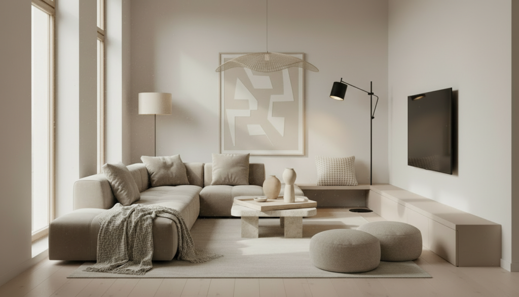
Red Flag signs appear fast when everything in your home sits in the same tone. All white. All grey. All beige. When no contrast exists, rooms fall flat.
This Red Flag shows up across GTA condos, townhomes, and detached houses. Builders lean toward safe palettes. Owners hesitate to add depth. The result feels clean yet unfinished. Watch our video above for step-by-step instructions on correcting this imbalance using one focused adjustment.
Great design depends on balance. Without contrast, space loses dimension.
Why It Matters
Contrast creates visual structure. It guides the eye. It defines zones. It builds character without clutter.
When walls, floors, furniture, and décor share similar tone, edges disappear. Rooms blend into one another. Even high-end finishes lose impact.
Design research from the Interaction Design Foundation outlines contrast as a core visual principle. It improves clarity and perception. The American Society of Interior Designers also highlights balance and contrast as central to spatial comfort and visual interest.
Beyond aesthetics, contrast affects resale. Buyers respond to rooms with depth and defined features. Listing photos perform better when focal points stand out.
Across the GTA, neutral staging dominates. This trend supports broad appeal. Though without layered contrast, homes risk looking interchangeable.
LifestyleVideos.com focuses on small design shifts tied to daily comfort and long-term value. Contrast ranks high on impact with low cost.
GTA Design Patterns and Market Trends
Recent GTA developments favour light oak floors, white cabinetry, and pale walls. Open-concept layouts amplify uniform tone. Natural light washes surfaces evenly.
This approach keeps space bright. It also removes visual anchors.
Detached homes built in the early 2000s often lean beige. Newer condos lean grey. Renovations often repaint everything in one shade.
Buyers touring multiple properties notice repetition. Homes with even one defined contrast element stand apart.
Design retailers across the GTA respond by stocking darker woods, matte black fixtures, textured fabrics, and stone accents. These additions restore depth without full renovation.
How to Add Contrast Without Overdesigning
Start small. One intentional move shifts the room.
Step one. Add one dark element. Choose a coffee table, console, headboard, or accent chair in a deeper tone. Place it where the eye lands first.
Step two. Introduce texture. Linen, wool, leather, or wood grain breaks monotony. Texture counts as contrast even within similar color families.
Step three. Anchor with black or charcoal accents. Picture frames, hardware, or lighting fixtures define edges.
Step four. Layer materials. Mix metal with wood. Pair smooth surfaces with woven textiles.
Step five. Define one focal point per room. Art, a bold rug, or a darker feature wall builds structure.
Watch our video above for step-by-step instructions showing this method applied in real GTA homes.
Avoid adding multiple bold colors at once. Restraint maintains cohesion. One strong move carries more weight than five small ones.
Common Mistakes to Avoid
Do not paint every wall dark. Contrast requires balance. Light needs shadow. Shadow needs light.
Do not rely on décor clutter. Extra objects do not equal depth. They create distraction.
Do not mix unrelated color families. Warm wood with cool grey requires a bridge element such as fabric or metal.
Contrast succeeds when controlled.
People Also Ask
What does contrast mean in home design
Contrast refers to differences in color, tone, texture, or material that create visual depth.
Does adding dark elements make a room smaller
When balanced with light surfaces, dark accents add dimension rather than shrink space.
How much contrast should a room have
One strong anchor piece per room supports clarity without overwhelming the design.
Thinking About It
A home without contrast feels flat. Character comes from balance, not excess.
You do not need new furniture across every room. Add one darker anchor. Add one natural texture. Define edges. Let surfaces stand apart.
Across the GTA, homes compete for attention in photos and showings. Intentional contrast signals care and design awareness.
LifestyleVideos.com shares practical home insights tied to market appeal and daily function. Watch the video above and apply one contrast shift today.
Related Articles
• 5-Minute Curb Appeal Home Hack